Visual Identity
+
Logo Design
+
Brand Guidelines
+
Website Design
+
Social Media Design
The Client
Film production with a genuine purpose.
Proper Good is a creative agency specialising in film production for organisations that are making a positive impact on the world. They live and breathe filmmaking — from scripted shorts and feature films to award-winning documentaries of all shapes and sizes, their team has made them all. Their clients include brands, agencies, and organisations across sectors, including non-profits, who believe that great storytelling can do more than entertain: it can inspire, connect, and drive real change.

The Brief
A brand that had fallen behind the business.
Proper Good embarked on a full strategic reset, working with strategy and messaging agency Treacle to define their positioning, mission, and tone of voice from the ground up.
With that strategic foundation in place, they came to me with a clear brief: build a brand that matches who they are today, and where they are going.

The PROCESS
From strategy to identity: Beaming positivity
My role was to translate that strategic thinking into a living, breathing visual identity.
I began by developing a range of concepts — each taking a different visual approach to the same strategic idea — before presenting them to the Proper Good team and working through a collaborative process of refinement and selection.
From there, I moved into a deeper development phase, expanding the most promising directions across a full range of real-world touchpoints.
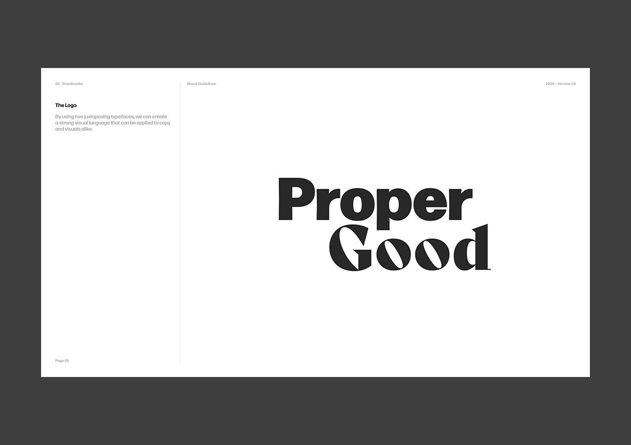
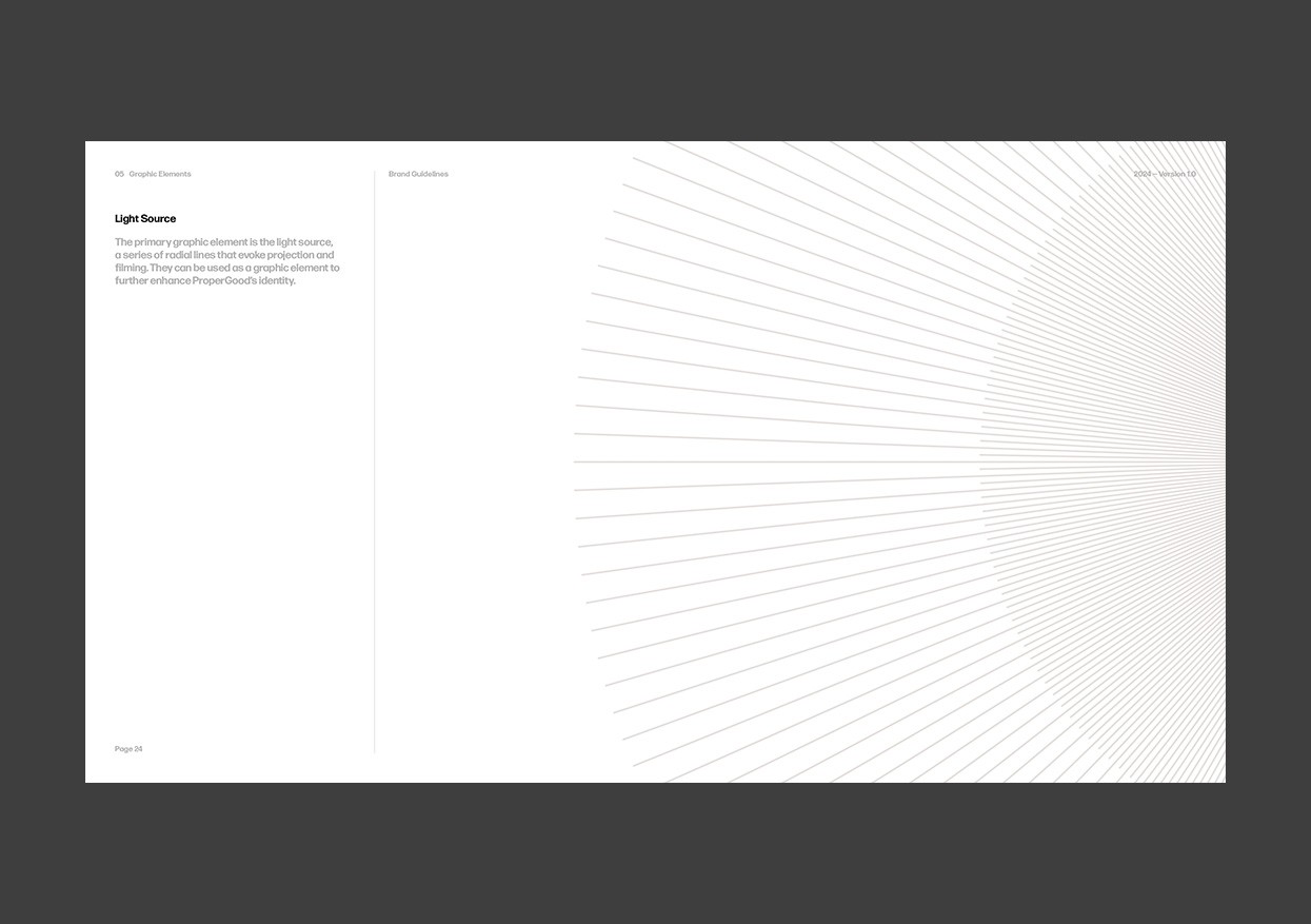
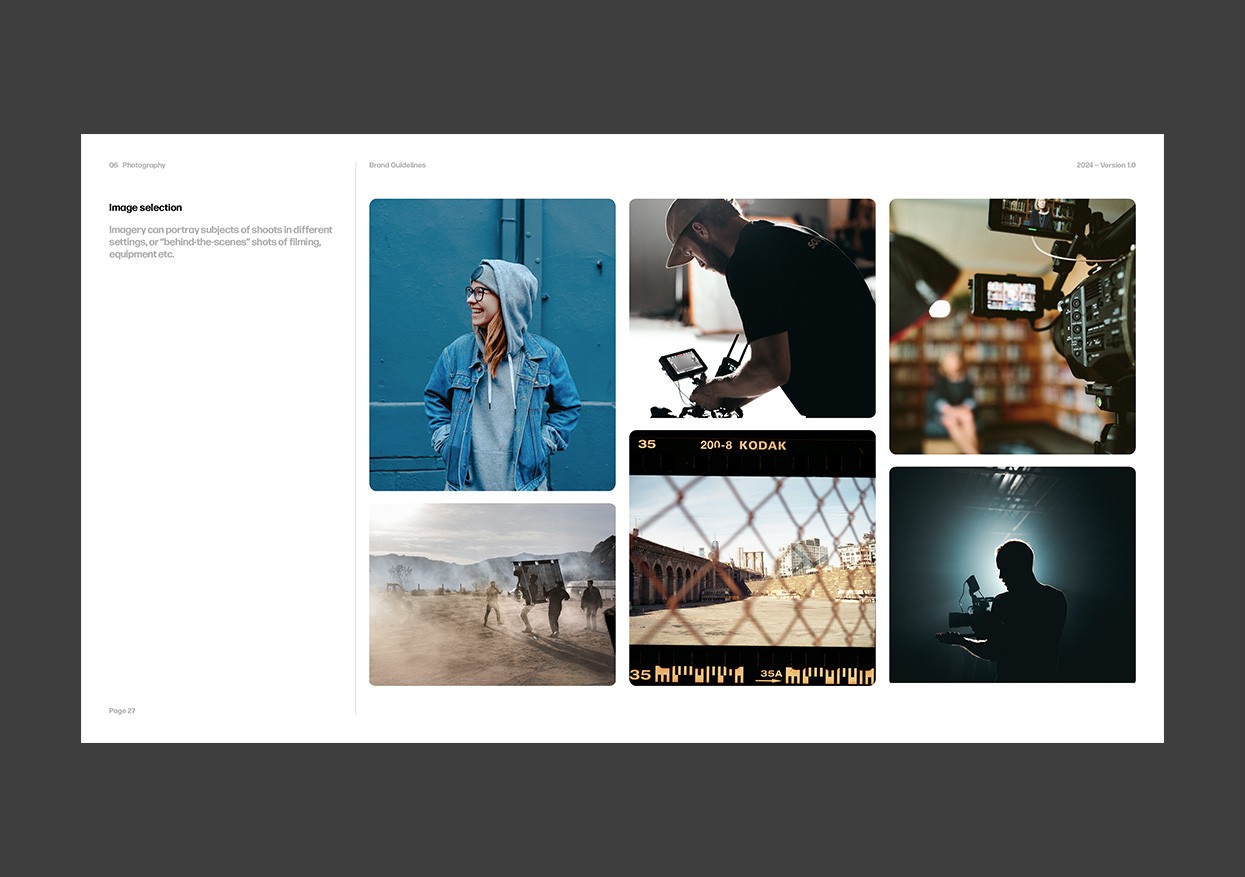
The breakthrough came with the rays. A graphic element radiating outward, the rays worked on multiple levels at once: visually, they referenced the mechanics of light and lens — the raw material of film. Conceptually, they expressed optimism, energy, and the positive ripple effect of Proper Good's work. And aesthetically, they gave the identity a sense of movement and warmth that felt completely right for the brand.
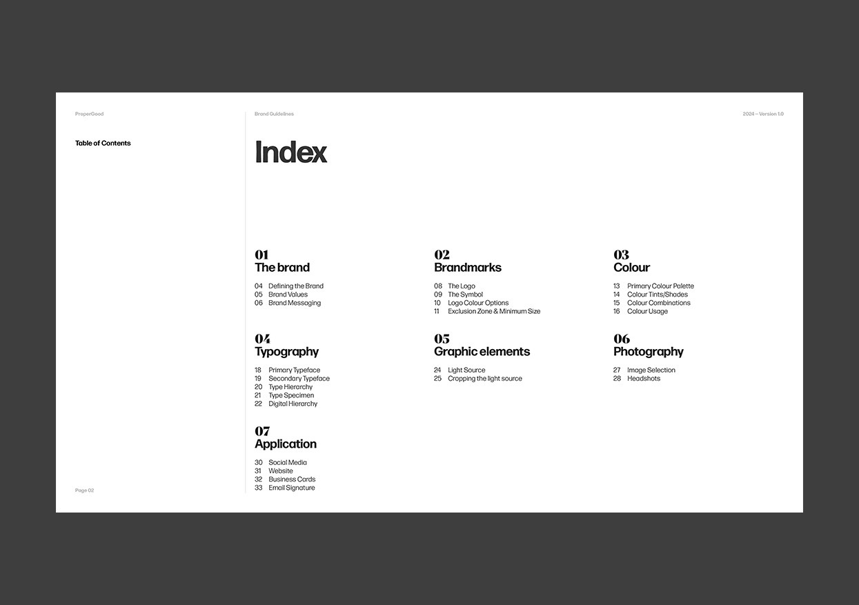
Paired with a logomark full of personality, the rays became the connective tissue that tied the whole system together — giving us a foundation to build out a full suite of brand assets with confidence. The final stage was delivery: a comprehensive set of assets, anchored by a detailed Brand Guidelines document designed to give Proper Good full ownership of their identity going forward.


The OUTCOME
A visual identity that reflects the work it represents
The finished identity feels unmistakably ProperGood: warm, purposeful, and quietly confident. The ray graphic — the heart of the identity — runs through every touchpoint, expressing light, positivity, and the illuminating power of great storytelling. Applied across the website, social channels, and broader brand collateral, it gives the identity both consistency and life.
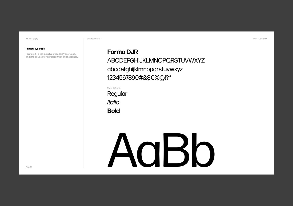
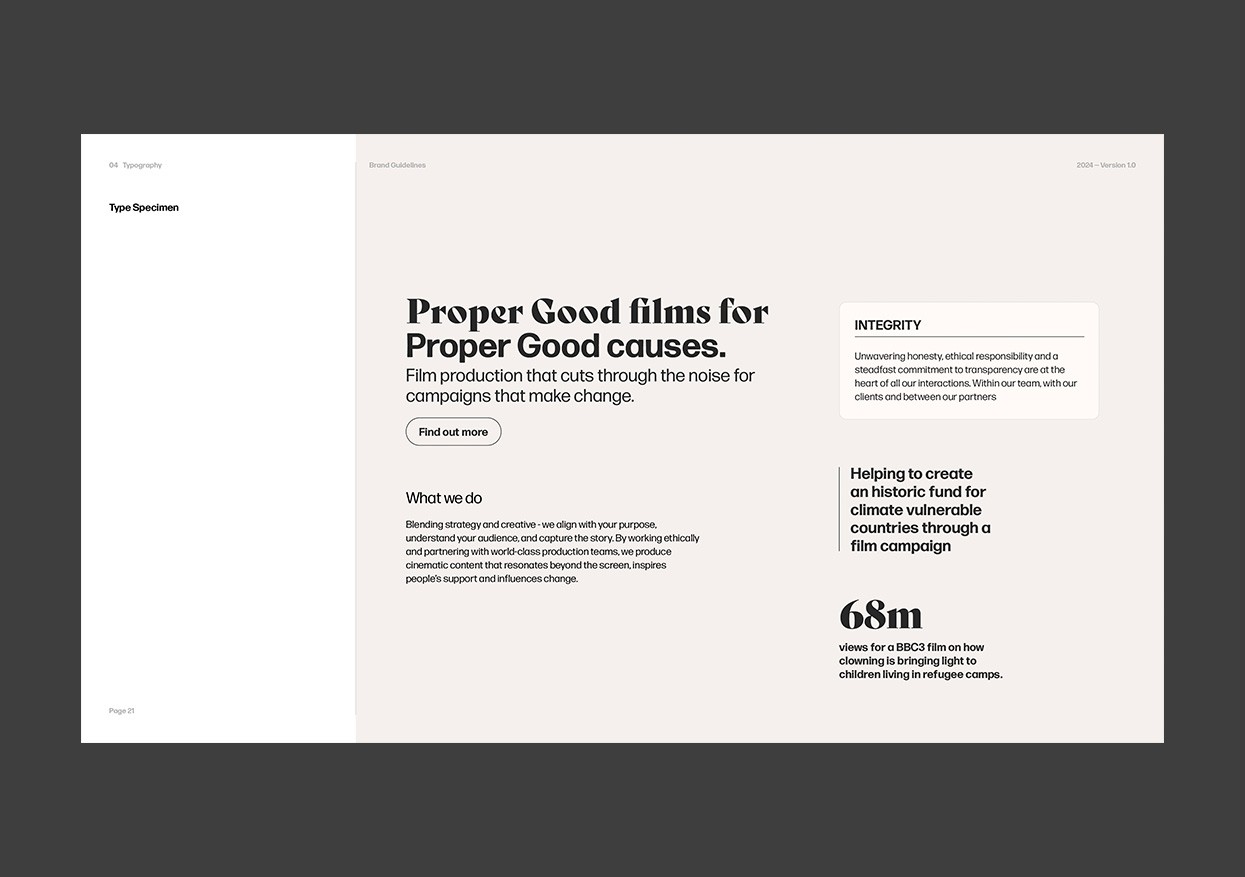
Typography plays a central role in how the brand communicates. Two contrasting typefaces work together to give Proper Good genuine expressive range — one for authority and clarity, one for warmth and character. The system is designed to be flexible in practice: individual words can be called out, sentences emphasised, and register shifted depending on what the moment calls for. It is typographic thinking that goes beyond aesthetics and into functionality.


The IMPACT
Confidence, clarity, and a brand that fits.
The response from Proper Good was everything we hoped for. Finally, they had a visual identity that matched the business they had built: one that communicated who they are, what they stand for, and why it matters.
Looking to elevate your visual identity?


Back