A bold identity for a newly independent agency, capturing the vibrant nature of the experiential events they deliver.
Visual Identity
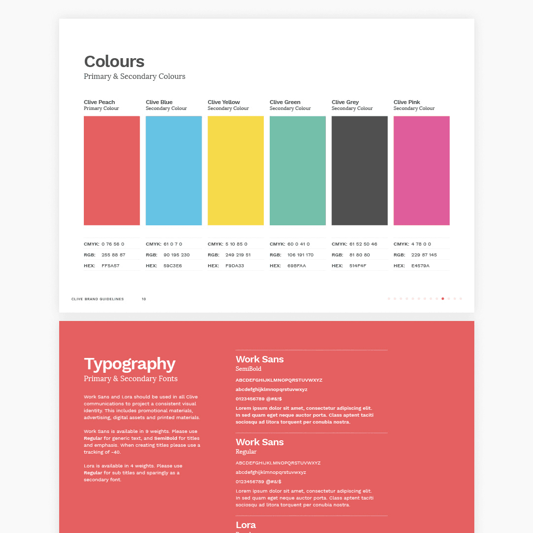
+
Brand Guidelines
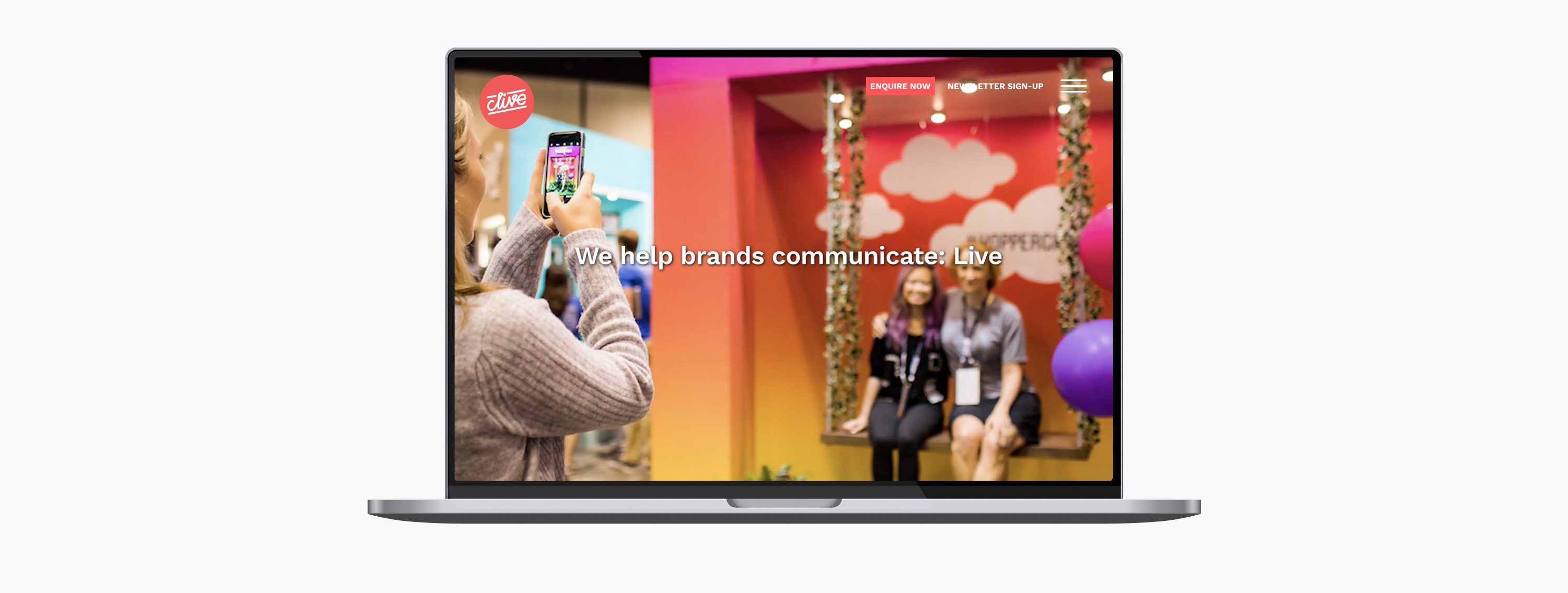
+
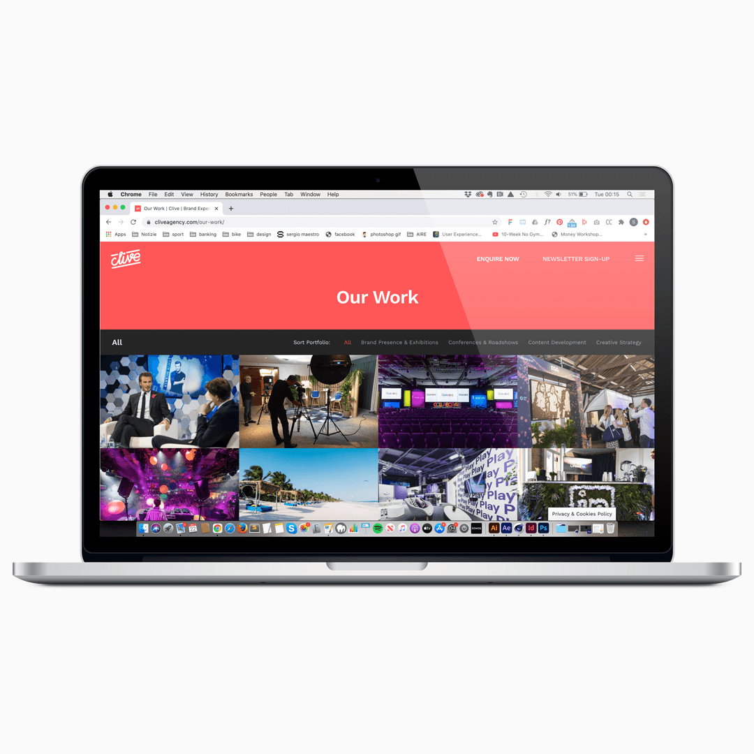
Web Design
+
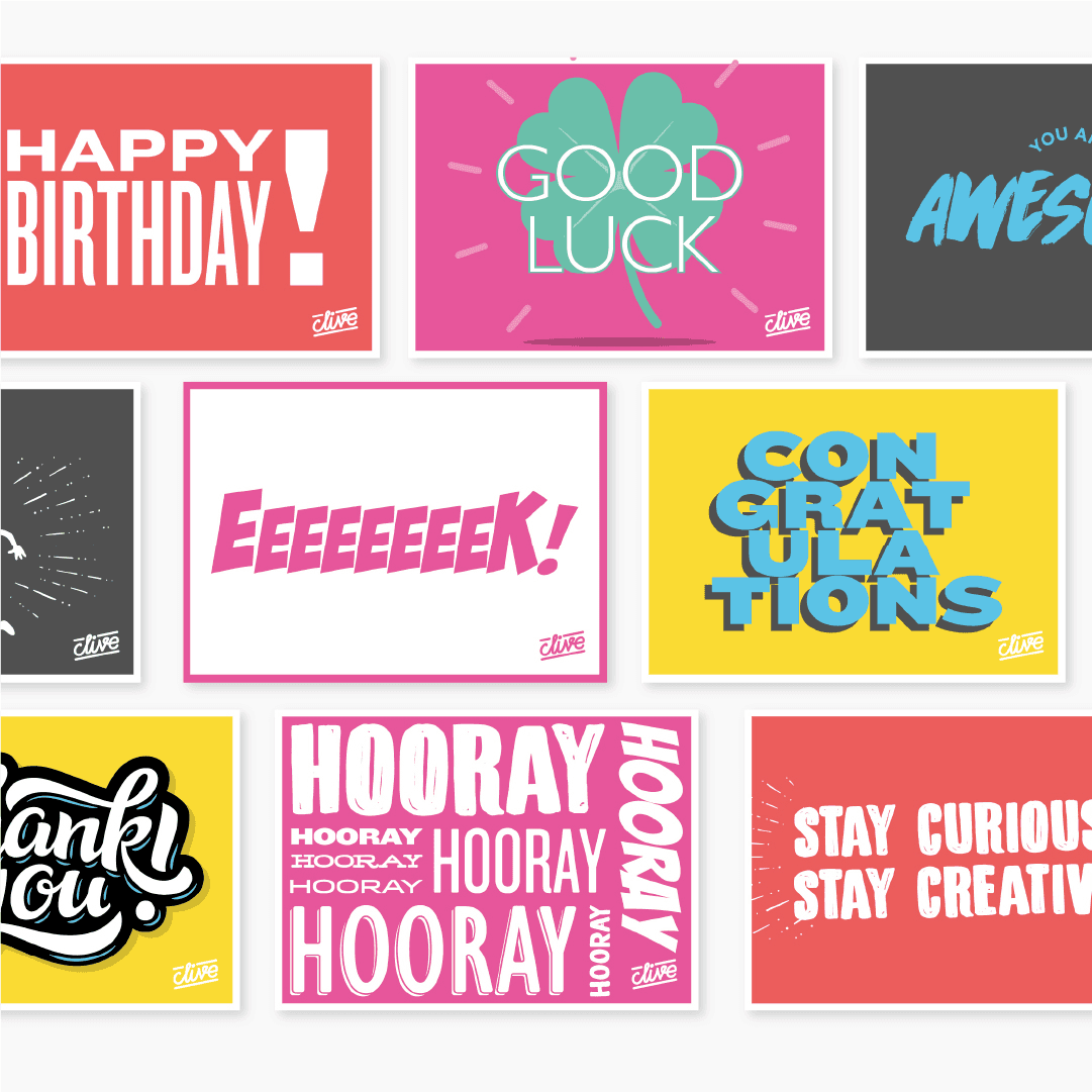
Marketing Materials
The Client
Serious fun, seriously delivered.
Clive Agency is a London-based events and brand experience agency with a track record that speaks for itself. Since 2010, they have delivered experiential, large-scale communications events for some of the world's most recognisable brands — including Facebook, Instagram, PlayStation, Honda Finance, BP, and Virgin Media. Whether it is a conference, a pop-up, an experiential tour, or an incentive event, Clive believes in the transformative power of live communication: the ability to create experiences that breed genuine understanding and build lasting brand advocacy.
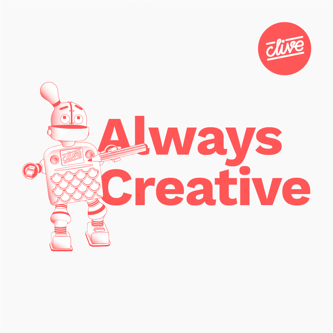
A 30+ people team, Clive is a tight, talented bunch — nimble enough to be genuinely creative, experienced enough to execute at the highest level. Their five core values — Operationally Excellent, Great at Relationships, Constantly Inquisitive, Always Creative, and Serious Fun — are not just words on a wall. They are the way the agency works every day.

The BRIEF
Going it alone.
Having been part of the Concerto Group — operating as Concerto Live, the live events arm of the wider organisation — the agency had been bought out by Managing Director and majority shareholder Nick Robinson. A new name. A new chapter. And an urgent need for a brand to match.
The brief was energising: create a brand mark that felt unique and playful, and build a bold visual identity around it that could carry the full, vibrant personality of the agency and the events they were known for delivering. This was not a cautious rebrand. It was a declaration of intent.

The PROCESS
Built from the inside. Lived from day one.
This project had an unusual and genuinely exciting dynamic: I was working as the Senior Designer embedded within the agency itself. With direct access to the stakeholders, I sat alongside the team every day, and was able to live the brand first-hand as it took shape.
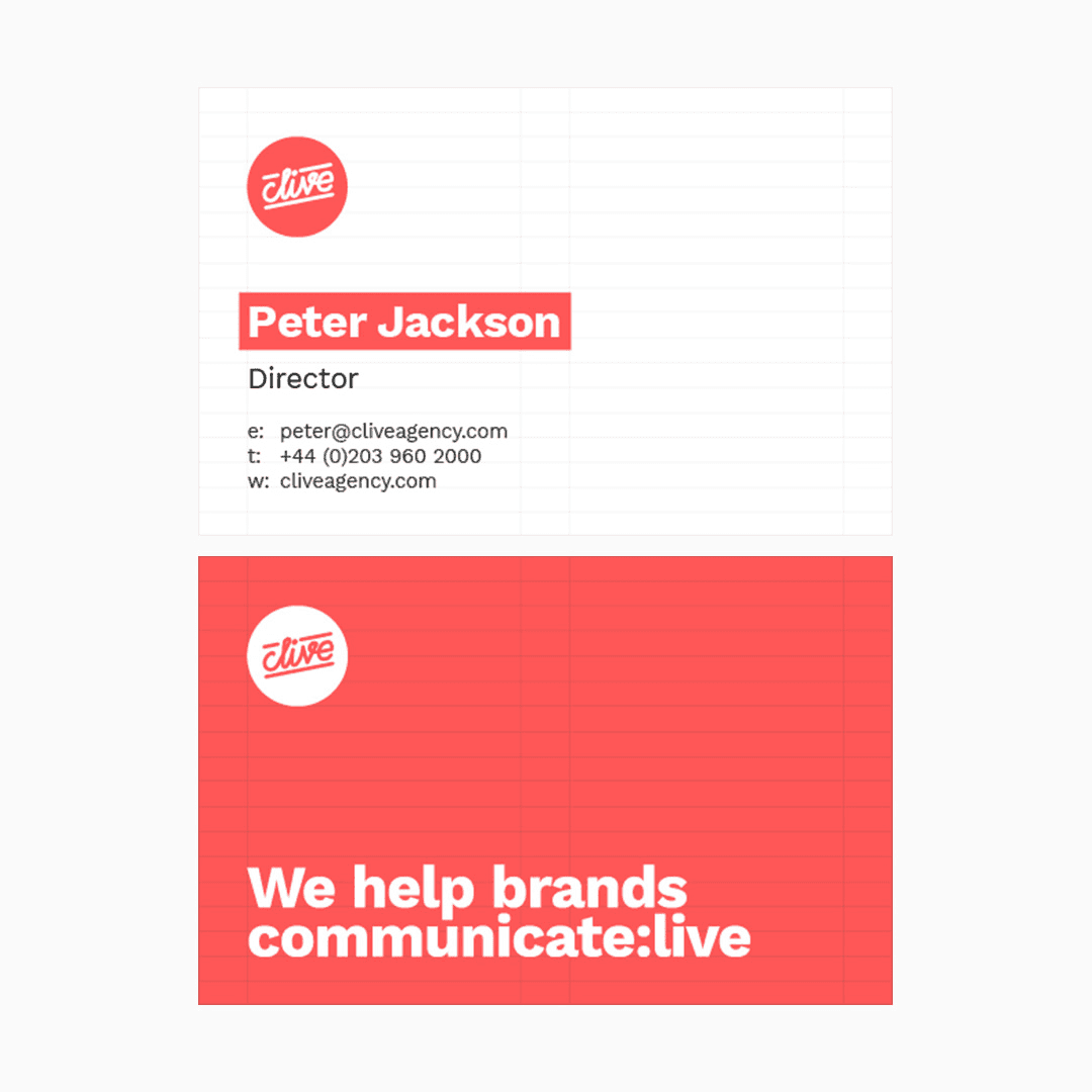
We explored several directions before landing on the approach that felt most true to Clive. The key insight was the signature-style mark: a logotype that felt handcrafted and personal, reflecting the deeply relationship-driven nature of the business. In an industry where trust and personality matter enormously, a mark that felt like it had been signed — rather than set — communicated exactly the right thing.


The OUTCOME
Bold, playful, and completely Clive.
The signature-style logomark gives the brand an immediate sense of personality and humanity — qualities that are central to how the agency works and how it wants to be perceived. It captures the evolution of the business and its vision for the future in a single, confident mark.
As Sean Doyle, Clive's Head of Creative Services, put it: This is a fresh new identity and a re-energised proposition — but behind the new Clive brand is the same team and the same values, known and trusted by many of the world's leading brands.
The IMPACT
A brand that reflects the people behind it.
The response to the rebrand was exactly what a new identity should produce: recognition, pride, and momentum. For the Clive team, the new brand was not just a visual change — it was an expression of who they had become and a signal of where they were going.
Looking to elevate your visual identity?


Back